Basic Color Correction Steps for Total Beginners
Learning color correction might seem scary at first, but it’s actually one of the most important skills you can develop as a content creator. Think of it like learning to cook – once you understand the basic ingredients and techniques, you can make almost anything taste better. Color correction works the same way with your photos and videos. It’s not about making everything look fake or oversaturated. Instead, it’s about bringing out the natural beauty that was already there and fixing common problems that happen when you’re shooting. Whether you took a photo that looks too dark, captured video that seems washed out, or noticed that your skin tone looks weird under certain lights, color correction can fix these issues and make your content shine.
Understanding What Color Correction Really Means
Color correction and color grading often get mixed up, but they’re actually different things. Color correction comes first and focuses on fixing technical problems with your footage or photos. It’s like doing basic maintenance on your car – checking the oil, filling up the tires, and making sure everything runs smoothly.
Color correction handles these main issues:
- Fixing exposure problems (too bright or too dark)
- Adjusting white balance (removing color casts)
- Setting proper contrast levels
- Balancing highlights and shadows
- Making skin tones look natural
Color grading, on the other hand, comes after correction and is more about creating a specific mood or style. Think of correction as fixing your content and grading as adding your personal artistic touch.
Most beginners jump straight to the fun creative stuff without doing proper correction first. This usually leads to problems down the road because you’re building on a shaky foundation. It’s like trying to paint a beautiful picture on a dirty canvas – the end result won’t look as good as it could.
Essential Tools You’ll Need
Before diving into the actual steps, let’s talk about what tools you’ll need. The good news is that you don’t need expensive software to get started. Many free and affordable options can handle basic color correction perfectly well.
Software Options for Beginners
Free Options:
- DaVinci Resolve (professional-grade, completely free)
- Adobe Lightroom Mobile (free version available)
- VSCO (basic correction tools included)
- Snapseed (Google’s free photo editor)
Paid Options:
- Adobe Lightroom CC ($9.99/month)
- Final Cut Pro ($299 one-time, Mac only)
- Adobe Premiere Pro ($20.99/month)
For absolute beginners, DaVinci Resolve offers the best value since it’s completely free but includes professional features. The learning curve is steeper, but you won’t outgrow it as your skills improve.
The Fundamental Color Correction Workflow
Every professional colorist follows a similar workflow, regardless of the software they use. This order matters because each step builds on the previous one. Skipping steps or doing them out of order can create more problems than you solve.
Step 1: Check Your Scopes and Analyze the Image
Before making any adjustments, you need to understand what’s wrong with your image. Most editing software includes tools called scopes that show you technical information about your footage or photo.
The most important scopes are:
- Waveform: Shows brightness levels across your image
- Vectorscope: Displays color information and saturation
- Histogram: Shows the distribution of tones from dark to bright
Don’t worry if these sound confusing at first. Start by simply looking at your image and identifying obvious problems. Is it too dark? Does it have a strange color cast? Are the highlights blown out (completely white with no detail)?
Step 2: Set Your Black and White Points
This step establishes the foundation for everything else you’ll do. The black point is the darkest part of your image, and the white point is the brightest part. Getting these right ensures you’re using the full range of brightness levels available.
In most software, you’ll find these controls labeled as:
- Lift/Shadows: Controls the dark areas
- Gain/Highlights: Controls the bright areas
- Gamma/Midtones: Controls the middle brightness levels
Start by adjusting the shadows until the darkest parts of your image are truly black (but still retain detail). Then adjust the highlights so the brightest parts are white without being blown out. This simple step often makes a dramatic improvement in how your content looks.
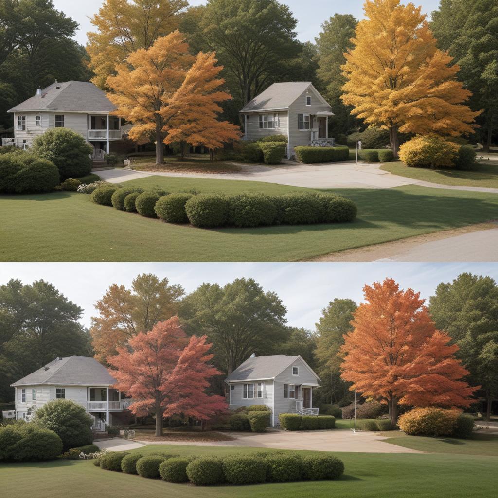
Working with White Balance
White balance is probably the most common problem beginners face, and it’s also one of the easiest to fix once you understand it. Different light sources have different colors – sunlight looks blue compared to indoor lights, which look orange or yellow.
Your camera tries to compensate for this automatically, but it doesn’t always get it right. When white balance is off, your entire image will have a color cast that makes everything look unnatural.
Identifying White Balance Problems
Look for these common signs:
- People’s skin looks too orange, blue, or green
- White objects in your image don’t actually look white
- The overall image feels “warm” (orange/yellow) or “cool” (blue) when it shouldn’t
Most editing software has an automatic white balance tool that works by clicking on something in your image that should be white or neutral gray. This often fixes the problem instantly, but you might need to fine-tune it manually.
Manual White Balance Adjustment
If the automatic tool doesn’t work well, you can adjust white balance manually using temperature and tint controls:
- Temperature: Moves between warm (orange) and cool (blue)
- Tint: Adjusts between green and magenta
Move the temperature slider toward blue if your image looks too orange, or toward orange if it looks too blue. Use the tint slider to remove green or magenta color casts.
Mastering Exposure and Contrast
Getting the right exposure means making sure your image isn’t too bright or too dark overall. Contrast refers to the difference between the darkest and brightest parts of your image. Both are crucial for creating images that look natural and engaging.
Basic Exposure Adjustments
Exposure controls typically include:
- Exposure: Overall brightness of the entire image
- Highlights: Bright areas only
- Shadows: Dark areas only
- Whites: The very brightest parts
- Blacks: The very darkest parts
Start with the overall exposure slider to get your image in the right ballpark. If it’s too dark, move it to the right. If it’s too bright, move it to the left. Don’t worry about getting it perfect right away – you’ll fine-tune with the other controls.
Next, use the highlights slider to bring back detail in overly bright areas. Pull it to the left to darken bright spots without affecting the rest of the image. Similarly, use the shadows slider to brighten dark areas that might be hiding important details.
Advanced Techniques for Better Results
Once you’ve mastered the basics, these techniques will help you take your color correction to the next level. They might seem complicated at first, but they’re just extensions of the fundamental concepts you’ve already learned.
Working with Color Wheels
Many professional colorists prefer color wheels over simple sliders because they offer more precise control. Color wheels let you adjust both the intensity and direction of color changes simultaneously.
Most software includes three color wheels:
- Shadows: Affects the dark areas of your image
- Midtones: Affects the middle brightness levels
- Highlights: Affects the bright areas
To use color wheels, drag the center dot toward the color you want to add to that tonal range. For example, if your shadows look too blue, drag the shadows wheel toward orange to warm them up.
Secondary Color Correction
Sometimes you need to adjust specific colors without affecting the entire image. This is called secondary color correction, and it’s incredibly useful for fixing specific problems or creating targeted effects.
Common uses include:
- Making skies more blue without affecting skin tones
- Adjusting the color of specific objects
- Fixing color problems in just part of the image
- Creating selective color effects
Most software lets you select colors using either color wheels or HSL (Hue, Saturation, Lightness) controls. You can then adjust just those selected colors while leaving everything else unchanged.
| Step | Purpose | Tools Used | Common Problems Fixed | Difficulty Level |
|---|---|---|---|---|
| Analyze Image | Understand what needs fixing | Scopes, visual inspection | Identifying issues | Easy |
| Set Black/White Points | Establish tonal range | Lift, Gamma, Gain | Poor contrast, flat image | Easy |
| White Balance | Remove color casts | Temperature, Tint | Orange/blue color casts | Easy |
| Exposure | Fix brightness | Exposure, Highlights, Shadows | Too bright/dark | Medium |
| Contrast | Improve depth | Whites, Blacks, Contrast | Flat, lifeless image | Medium |
| Color Wheels | Fine-tune color balance | Shadow/Mid/Highlight wheels | Complex color issues | Hard |
| Secondary Correction | Target specific colors | HSL, Color selection | Selective color problems | Hard |
Common Mistakes Beginners Make
Learning color correction involves making mistakes – that’s completely normal and part of the process. However, knowing about common pitfalls can help you avoid some frustration and get better results faster.
Over-Correcting Your Images
The biggest mistake beginners make is going too far with their adjustments. Just because you can make the sky super blue or the sunset extremely orange doesn’t mean you should. Good color correction should look natural and serve the story you’re trying to tell.
Signs you’ve gone too far:
- People’s skin looks unnatural or plastic
- Colors are more saturated than they appear in real life
- The image has a “processed” look that draws attention to itself
- Details are lost in shadows or highlights
Ignoring the Overall Story
Color correction should support your content, not distract from it. Before making any adjustments, think about the mood and message you want to convey. A corporate video should probably look clean and natural, while a creative project might benefit from more stylized color work.
Not Using Reference Images
Professional colorists often use reference images to guide their work. These might be still frames from movies, photos with similar lighting, or even color swatches that represent the mood they’re trying to achieve.
“Color correction is like seasoning food – a little bit can make everything better, but too much ruins the whole dish.”
Practice Exercises to Build Your Skills
The only way to get good at color correction is through practice. These exercises will help you develop your eye and build muscle memory for the most important techniques.
Exercise 1: Fix Common Problems
Find images with obvious color problems and practice fixing them:
- Photos taken under fluorescent lights (often green cast)
- Sunset photos that look too orange
- Indoor photos that seem too yellow
- Overcast day photos that appear too blue
Exercise 2: Match Different Shots
Take several photos or video clips shot in different conditions and try to make them look consistent. This is one of the most practical skills you’ll use in real projects.
Exercise 3: Recreate Professional Looks
Find movie stills or professional photos you admire and try to recreate their color treatment using your own footage. This helps you understand how different color choices create different moods.
Building Your Color Correction Workflow
Developing a consistent workflow is crucial for getting reliable results. Professional colorists follow the same steps every time because it ensures they don’t skip important corrections and helps them work more efficiently.
A typical beginner workflow might look like this:
- Import and organize your footage
- Apply basic exposure corrections
- Fix white balance issues
- Set proper contrast levels
- Make any necessary secondary corrections
- Add creative grading (if desired)
- Export and review on different devices
Start simple and gradually add more steps as your skills improve. It’s better to do a few things well than to attempt everything and get overwhelmed.
FAQ Section
Q: How do I know when my color correction is finished? A: Good color correction should look natural and support your content without drawing attention to itself. If viewers comment on how “processed” your work looks, you’ve probably gone too far. Trust your eyes, but also check your work on different monitors and devices.
Q: Should I shoot in RAW format for better color correction? A: If your camera supports it, yes. RAW files contain much more color information than JPEG files, giving you more flexibility when making corrections. However, good technique can produce excellent results even with compressed formats.
Q: Can I fix really bad footage with color correction? A: Color correction can fix many problems, but it has limits. Severely overexposed footage (completely white areas) or underexposed footage (completely black areas) may not be salvageable because there’s no image information to work with.
Q: How long should it take to color correct a photo or video? A: For beginners, expect to spend 10-30 minutes on basic correction for a single image or short video clip. As you get faster and develop your workflow, this time will decrease significantly.
Q: Do I need expensive monitors to do good color correction? A: While professional monitors help, you can do good basic correction on any decent computer monitor. The key is understanding your monitor’s characteristics and checking your work on multiple devices.
Q: What’s the difference between color correction and filters/presets? A: Filters and presets apply the same adjustment to every image, regardless of what problems it might have. Color correction involves analyzing each image individually and making specific adjustments based on what that particular image needs.
Q: Should I correct photos differently than video? A: The basic principles are the same, but video has additional considerations like consistency between shots and temporal changes. Photos can be corrected in isolation, while video shots often need to match each other.