5 Editing Mistakes That Make Photos Look Fake: How to Keep Your Images Natural and Believable
Have you ever looked at a photo and immediately thought “that’s been heavily edited”? Maybe the skin looked too smooth, the colors seemed off, or something just felt unnatural about the whole image. We’ve all seen those photos that scream “fake” from a mile away, and unfortunately, many of us have accidentally created them ourselves. The truth is, good photo editing should enhance your images without making them look artificial. When done right, people should admire your photo’s beauty without questioning whether it’s real or not.
The most common editing mistakes that make photos look fake include over-smoothing skin and textures, pushing saturation and vibrance too far, creating unrealistic lighting effects, using heavy-handed HDR processing, and making poor color grading choices that don’t match natural light conditions. These errors happen when editors focus too much on making dramatic changes rather than subtle enhancements that preserve the photo’s authenticity and natural appearance.
Understanding What Makes Photos Look Artificial
Before diving into specific mistakes, it’s important to understand what our eyes naturally expect to see in a photograph. Human vision has evolved to recognize natural patterns, textures, and lighting conditions. When these elements are altered too dramatically during editing, our brains immediately sense something is wrong.
The goal of photo editing should always be to enhance what’s already there, not to completely transform reality. Professional photographers and editors know that the best edits are often invisible – they improve the image without calling attention to the editing process itself.
The Psychology Behind “Fake” Looking Images
Our brains process visual information incredibly quickly, often within milliseconds. When we see unnatural skin textures, impossible lighting scenarios, or colors that don’t exist in nature, we instinctively recognize these as artificial. This recognition happens before we even consciously think about it.
Understanding this psychological response helps explain why some heavily edited photos make us uncomfortable, even if we can’t immediately pinpoint what’s wrong with them.
Mistake #1: Over-Smoothing Skin and Textures
The Plastic Skin Problem
This is probably the most obvious sign of heavy-handed editing. When editors use blur tools, smoothing filters, or healing brushes too aggressively, skin ends up looking like plastic or porcelain. Real skin has pores, fine lines, and subtle texture variations that give it life and authenticity.
Many editing apps and filters promise “perfect skin” with one click, but these automated tools often go too far. They remove not just blemishes but also the natural texture that makes skin look real.
How to Fix It
Instead of smoothing everything, focus on spot corrections. Remove obvious blemishes, but leave natural skin texture intact. Use healing tools at lower opacity settings – around 30-50% rather than 100%. This allows you to gradually build up corrections without overdoing them.
Pro Tip: Zoom out to 100% view regularly while editing skin. What looks good at 300% zoom often looks unnatural at normal viewing size.
When working on portraits, pay attention to areas like:
- Natural laugh lines and expression marks
- Subtle skin texture on cheeks and forehead
- Individual eyelashes and eyebrow hairs
- Natural lip texture and slight asymmetries
Preserving Natural Details
Create a duplicate layer before smoothing, then use layer masks to selectively apply changes. This technique lets you smooth problem areas while preserving natural texture in others. You can also reduce the opacity of your smoothing layer to dial back the effect.
Mistake #2: Pushing Saturation and Vibrance Too Far
When Colors Attack
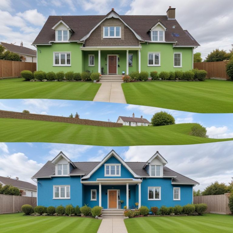
Cranking up saturation might seem like an easy way to make photos more exciting, but it’s often the fastest route to fake-looking images. Over-saturated photos have several telltale signs: skin tones that look orange or red, skies that appear unnaturally blue, and grass that’s almost neon green.
The difference between saturation and vibrance is crucial here. Saturation affects all colors equally, while vibrance primarily boosts muted colors and protects skin tones. However, even vibrance can be overdone.
Natural Color Enhancement
Instead of pushing one slider to the extreme, make subtle adjustments to multiple color settings. Use the HSL (Hue, Saturation, Lightness) panel to adjust individual color ranges. This gives you much more control and helps maintain natural-looking results.
For outdoor photos, pay special attention to:
- Sky blues: Should never look electric or neon
- Grass greens: Natural grass has yellow and brown undertones
- Skin tones: Should maintain their natural warmth without looking sunburned
The 80% Rule
A good rule of thumb is to make your color adjustments, then dial them back by about 20%. If you think your saturation looks perfect at +40, try +32 instead. This small reduction often makes the difference between “wow” and “fake.”
Mistake #3: Creating Unrealistic Lighting
Impossible Light Sources
One of the quickest ways to make a photo look fake is to create lighting that couldn’t exist in reality. This includes adding dramatic rim lighting that doesn’t match the environment, creating multiple conflicting shadows, or brightening areas that should naturally be in shadow.
Light behaves in predictable ways, and our eyes are trained to recognize these patterns. When you add artificial lighting effects that don’t follow these natural rules, the result looks immediately suspicious.
Understanding Natural Light Behavior
Before adding any lighting effects, ask yourself: “Where would this light be coming from?” Light should have a logical source and should interact with all elements in the scene consistently.
Common lighting mistakes include:
- Adding bright rim light when the background is dark
- Creating perfectly even lighting in outdoor scenes
- Ignoring how light interacts with different materials
- Adding catchlights to eyes that don’t match the environment
Subtle Enhancement Techniques
Instead of dramatic lighting effects, focus on enhancing existing light. Use dodge and burn techniques to subtly guide the viewer’s eye, but always follow the natural light direction already present in the image.
When working with portraits, use a large, soft brush at low opacity (5-10%) to gradually build up lighting effects. This creates natural-looking results that enhance rather than replace the original lighting.
Mistake #4: Heavy-Handed HDR Processing
The HDR Horror Show
High Dynamic Range (HDR) processing can create stunning images when used correctly, but it’s easy to go overboard. Over-processed HDR images have a distinctive “cartoon” look with unnatural color halos, extreme contrast, and an overall artificial appearance.
The telltale signs of bad HDR include:
- Glowing edges around objects (haloing)
- Flat, lifeless shadows with too much detail
- Surreal color combinations that don’t exist in nature
- Extreme contrast that hurts to look at
Balanced HDR Techniques
Good HDR processing should expand the dynamic range while maintaining natural-looking results. Start with subtle settings and gradually increase them until you achieve the desired effect without crossing into artificial territory.
Key HDR best practices:
- Keep structure/clarity adjustments moderate
- Avoid pushing highlights and shadows to extremes
- Maintain some contrast – perfectly flat images look unnatural
- Check your work at 100% zoom for haloing artifacts
Alternative Approaches
Instead of relying on heavy HDR processing, consider these alternatives:
- Exposure blending: Manually combine multiple exposures
- Luminosity masking: Selectively adjust different tonal ranges
- Gradient filters: Simulate graduated neutral density filters
These techniques give you more control and typically produce more natural-looking results.
Mistake #5: Poor Color Grading Choices
When Filters Go Wrong
Color grading can completely transform the mood of an image, but poor choices quickly make photos look artificial. Common mistakes include applying trendy filters without considering the image content, creating color combinations that don’t exist in nature, or making skin tones look unhealthy.
Understanding Color Harmony
Natural-looking color grades follow basic principles of color theory. Colors should work together harmoniously, and the overall tone should match the scene’s natural lighting conditions.
Avoid these color grading pitfalls:
- Teal and orange overload: This popular combination is often overdone
- Split-toning extremes: Pushing highlights and shadows to opposite color extremes
- Ignoring skin tones: Always check how your grades affect human subjects
- Mismatched moods: Warm grades on cool-lit scenes (and vice versa)
Natural Color Grading Workflow
Start by analyzing the natural light in your scene. What color temperature was the ambient light? What mood are you trying to convey? Your color grade should enhance these existing elements rather than fight against them.
Use color wheels and curves instead of heavy-handed filters. Make subtle adjustments to:
- Highlights: Often slightly warm in natural daylight
- Shadows: Usually slightly cooler than highlights
- Mid-tones: Should maintain natural skin tone colors
Quick Reference Comparison Table
| Editing Aspect | Natural Look | Fake Look |
|---|---|---|
| Skin Texture | Visible pores, natural lines | Plastic smooth, no texture |
| Color Saturation | Rich but believable | Neon, electric, oversaturated |
| Lighting | Consistent light source | Multiple conflicting shadows |
| HDR Processing | Expanded dynamic range | Cartoon-like, heavy haloing |
| Color Grading | Harmonious, mood-appropriate | Trendy filters, unnatural tones |
| Overall Feel | Enhanced reality | Obviously manipulated |
How to Train Your Eye
Developing Critical Vision
The best way to avoid these mistakes is to develop a critical eye for natural-looking images. Study photographs from master photographers and analyze what makes them look authentic. Pay attention to how light behaves, how colors interact, and how textures appear in real life.
Practice Restraint
Less is often more in photo editing. Make your adjustments, then step away from the computer for a few minutes. When you return, you’ll often notice if you’ve gone too far. Fresh eyes are incredibly valuable in the editing process.
Get Feedback
Show your edited images to friends or fellow photographers. Sometimes we become so focused on our editing that we lose perspective. Others can often spot artificial-looking elements that we’ve become blind to.
Building a Natural Editing Workflow
Start Subtle
Begin with global adjustments like exposure, contrast, and white balance. These foundational changes should get your image 80% of the way to your vision before you start making local adjustments.
Work in Layers
Use adjustment layers and masks for all your edits. This non-destructive approach lets you dial back any effect that proves too strong. You can also reduce layer opacity to fine-tune the intensity of your edits.
Regular Reality Checks
Throughout your editing process, toggle your adjustments on and off to see the before and after. If the difference is shocking, you’ve probably gone too far. Aim for “wow, this looks amazing” rather than “wow, this looks heavily edited.”
Frequently Asked Questions
Q: How can I tell if my editing has gone too far? A: Take breaks while editing and come back with fresh eyes. If your first reaction is “this looks processed,” dial it back. Also, zoom out to normal viewing size – effects that look good at high magnification often appear overdone at 100% view.
Q: Is there a way to practice recognizing over-edited photos? A: Yes! Study before/after comparisons from professional retouchers and analyze what makes their “after” images look natural. Also, browse social media critically and try to identify obviously edited images to train your eye.
Q: What’s the best way to smooth skin without making it look plastic? A: Use frequency separation or work with healing tools at reduced opacity. Always preserve some natural texture, and focus on removing obvious blemishes rather than creating perfect skin.
Q: How much saturation is too much? A: If colors look more vibrant than they could appear in real life, you’ve gone too far. Natural outdoor scenes rarely have electric blues or neon greens. When in doubt, reduce your saturation by 20% from where you think it looks perfect.
Q: Can I fix an over-processed image? A: If you worked non-destructively with layers and masks, you can dial back your effects. If not, you might need to start over with the original RAW file. This is why saving your work in layers is so important.
Q: What editing software is best for natural-looking results? A: The software matters less than your technique. Lightroom, Photoshop, Capture One, and even mobile apps can produce natural results when used skillfully. Focus on learning proper techniques rather than relying on one-click filters.
Q: How do I know if my monitor is showing accurate colors? A: Consider calibrating your monitor, especially if you’re serious about photo editing. Viewing your images on different devices (phone, tablet, laptop) can also help you spot color issues that might not be obvious on your main editing display.